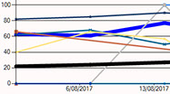
Performant charts (the evolution of PDSA-Plan Do Study Act).
A practical tool for practice owners, practice managers and those interested in improving preventive care delivered by general practice.
Scenario: We want to improve the practice wide performance in chlamydia screening(substitute any DCP guideline or biiling item here).
Methodology:
Hold team meeting with brief discussion of recommended guidelines regarding chlamydia screening. Display the performant chart for our practice comparing to national performance and the comparison of superheroes. One of our superheroes does very well yet others do not. All superheroes are brought on board with the requirement to do better in chlamydia screening. Set a goal to improve performance. At the next team meeting a brief review of chlamydia screening performance via display of the performant time-line chart.
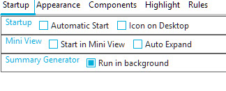
Access via Functions Icon

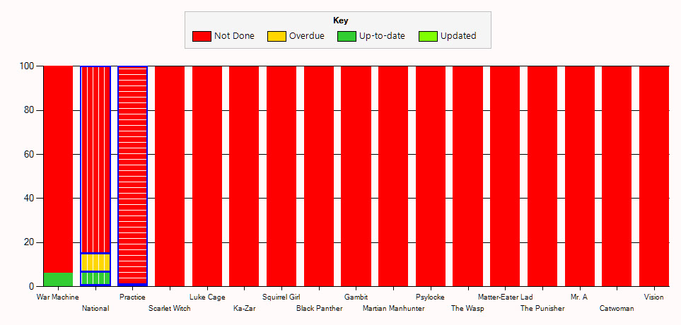
Stacked Column Display of % patients in each status by superhero
The Key point is that National performance is much better than our practice. Only one superhero is aware/performing chlamydia screening.
Each chart column is labeled below it.
Each column represents either
A doctor (aliased as a superhero name to preserve anonymity)
The Practice average - "Practice" column.
The National average - "National" column.
The columns are stacked with proportions of Chlamydia screening
RED: NOT DONE
YELLOW: OVERDUE
GREEN: UP TO DATE
BRIGHT GREEN: PERFORMED IN PERIOD OF ANALYSIS(1 week)

GREEN IS BETTER
Background:
Improving preventive care provision within general practice requires a mechanism for assessing status and tracking changes in status. A reference point representing peergroup status is useful in providing a minimum target endpoint.
Data collection:
Collection of data is automatic, anonymized and secure.
Opt Out:
Turn off data collection using settings Summary Generator
De-select the Check Box
What is the Practice Column?
Simply a tally of endpoints of all providers in the practice.
What is the National Column?
Simply a tally of endpoints for all practices contributing data.
Who is allowed to view the data
Practice owners and managers to have access to easy visual representation of practice wide data and national summary. (all Columns)
Other providers have access to their own, practice and national column (three columns)(facilitating a self checking feedback loop).
Data ownership and security:
Practices own the data.
Practices share summary data to contribute to the national tally of practices for the sole purpose of allowing peergroup comparison.
Data is stored in a cloud in summary format.
Data is obfuscated in storage and only retrievable by the data owner, apart from the national summary which is shared amongst all practices.
Individual patient cloud id can be reconstituted to identifiable patient only back at the originating practice.
No patient identifiable data is stored in the cloud.
Data is not sold or distributed by Doctors Control Panel Services(We consider it your data).
Superheroes?
Charts display anonymous names(superheroes) or providers names - configurable. (Anonymous display in team meetings is less confronting)
A tour of the user interface
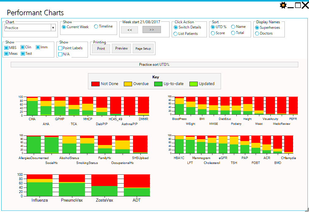
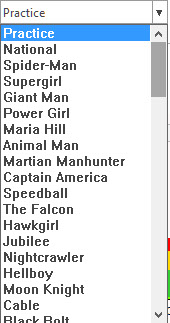
List of Chart items to display
Contains
'Practice'
'National'
List of providers
Selecting any of the above will show the summary charts for all preventive care items.
List of individual items
Selecting any of the items will show the summary comparison charts for all providers.
Current Week
Displays Stacked Columns of current selected chart item for the current selected week.
Time line chart
Display time line charts of recent 4+ weeks summaries
Select Current Week
When displaying Stacked Columns, use these this to change the selected week.
Click Action = Switch Details
Clicking on columns will switch to the chart for item shown on the name of column.
Click Action = List Patients
Clicking on columns will switch to the list of patients having the status of the section of the column eg NotDone
Sort = UTD%
Columns will display the percentages of items in each status and be sorted left to right by value up-to-date.
Sort = Name
Columns will display the total numbers of items in each status and be sorted left to right by name.
Sort = Score
Columns will display the total numbers of items in each status and be sorted left to right by score which is calculated
Update * 3 + UTD - NotDone
Sort = Total
Columns will display the total numbers of items in each status and be sorted left to right by total number of patients.
Display Names = Superheroes
Random superhero names will be displayed. (Randomised at each use of performant charts)
Display Names = Doctors
Provider Names will be displayed
Show Sections
Select which sections to show
Note that finer grained selections are possible in settings at top right
Point Labels
Show numbers on charts
N/A
Include the display of Not Applicable status in charts
Print Functions
Basic print functions for printing chart